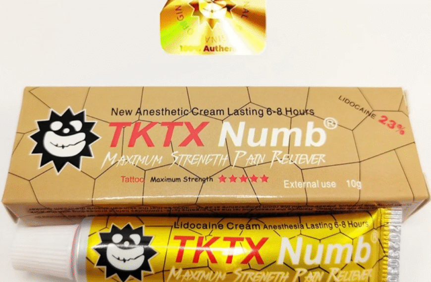
Shoppers make up their minds fast, and food brands that do not impress in that tiny window risk being ignored completely. On busy shelves, labels act like quick-fire pitches to tired eyes and hungry brains. When design, print quality and messaging all support each other, your products feel like the obvious choice for the customer, not a risky experiment.
Most buyers decide in a few seconds whether a product looks worth their money or likely to disappoint. That is where high quality label printing comes in, turning design ideas into sharp, reliable on-shelf reality. If labels peel, fade or look misaligned, people quickly assume the same about what is inside. Good psychology needs good execution, or the whole effect falls apart quietly.
Split Second Choices On Crowded Shelves
Fast Visual Judgements That Stick: In those crucial first seconds, shoppers scan for colour blocks, brand marks and legible product names. They are not studying every detail, they are searching for something that feels safe, tasty and worth the price. Consistent, accurate print across your range makes those snap decisions lean in your favour, instead of nudging buyers to better-looking competitors.
Risk Aversion And Rejection: People are naturally wary of making a bad choice with food, especially for children, guests or special diets. If labels look messy, cheap or confusing, their brain quietly flags that product as higher risk. Even if the recipe is brilliant, a poor label suggests corner cutting, expired stock or low standards, which is the last thing shoppers want to gamble on.
Reassurance At Arm’s Length: Strong labels do a lot of reassuring before anyone picks up the pack. Clear product names, visible claims and consistent colours help shoppers feel they already “know” the item from a distance. A reliable printing partner helps keep that reassurance consistent across stores, batches and new product launches, even when timelines feel uncomfortably tight.
Colour, Type And Images That Persuade
Colour Cues That Guide Emotion: Colour is one of the fastest psychological triggers in food buying. Greens and neutrals hint at natural and fresh, deep reds and golds suggest indulgence or richness, and bright tones shout fun or convenience. When those colours print correctly every time, your brand personality feels stable, not unpredictable. Poor colour control ruins that emotional shortcut instantly.
Typography That Signals Quality: Shoppers may not know font names, but they instinctively read tone from letterforms. Confident, clean type suggests care and reliability, while jittery spacing or fuzzy edges scream low effort. Strong print resolution and controlled print registration keep typography crisp, so even small text feels deliberate and trustworthy rather than rushed or improvised.
Imagery That Feels Honest: Over-styled photos can sometimes trigger scepticism, especially in health-conscious shoppers. Simple ingredient imagery, honest product shots and clean icons tend to feel more believable. When these visuals are printed with the right contrast and sharpness, they help your label tell a believable story, instead of looking like a stock image pasted on as an afterthought.
Clarity Over Chaos Builds Trust
Information Hierarchy That Respects Buyers: Cluttered labels force people to work too hard to find what they care about, and most will not bother. A clear hierarchy, with product name, key benefit and essential details easy to scan, signals respect for the shopper’s time. When print quality supports that layout, scanning becomes painless rather than tiring.
Honest Claims That Hold Up: Vague promises or crowded health claims can actually erode trust, especially if they feel exaggerated. Clear, specific wording, supported by legible icons and certifications, helps buyers feel safe. Sharp print and consistent placement of these claims across your range make it easier for returning customers to find the reassurance they expect.
Regulatory Details Without Overwhelm: Ingredients, allergens and nutrition must be readable, not hidden in a corner. When these are organised cleanly and printed at a legible size, shoppers feel the brand has nothing to hide. Try squeezing too much into tiny areas and people either walk away or assume something is being buried, which costs sales and loyalty in the long run.
Breathing Space That Makes Labels Readable
White Space As A Sales Tool: Empty space on a label can feel scary for some brands, yet it is one of the strongest readability weapons. White space separates key elements so the eye can relax, scan and decide without stress. When combined with precise print and neat alignment, that openness reads as confidence, not laziness.
Minimal Layouts That Cut Through Noise: Minimalism is not about stripping away personality, it is about giving the right ideas centre stage. A tidy layout with clear zones for name, claim and legal text is easier to process quickly. When that structure is supported by consistent printing, your product becomes easier to recognise again and again, even in chaotic retail environments.
Legibility Across Real Conditions: Labels need to stay readable in bright lights, fridge doors and busy kitchens. Good contrast, sensible font sizes and reliable finishing help text stay sharp despite condensation, oils or repeated handling. When print finishes are chosen carefully, they protect clarity rather than just adding decoration that flakes or smears.
Stories That Stick In The Shopper’s Mind
Brand Personality Without A Lecture: People do not want an essay, but they do want to feel who they are buying from. Short, well-placed storytelling lines about origin, craft or care help create that connection. Printed with clarity and supported by icons or small visuals, these snippets give buyers reasons to feel proud, not nervous, about choosing your product.
Values That Feel Lived, Not Performed: Claims about sustainability, community or quality need to match the rest of the label. Eco cues, sourcing information and honest tone work better when backed by suitable materials and finishes. When a brand pairs credible stories with matching paper stocks and finishes, those values feel authentic rather than staged purely for attention.
Emotional Triggers That Encourage Loyalty: A good story makes a product feel like a smart, emotionally satisfying choice, not just a random grab. Visual cues and short text together can remind shoppers of family meals, personal goals or dietary wins. Over time, those emotional nudges help your products become the default pick, especially when other labels look forgettable or chaotic.
See also: How to Manage Academic Stress in 2026: A Guide for Australian Students
Practical Principles That Protect Sales
Design Choices That Avoid Costly Mistakes: Practical design means understanding where labels will live, how they will be handled and what could damage them. Matching materials to environment, ink choice to product type and layout to container shape stops expensive failures. Brands that ignore these fundamentals often face peeling edges, blurred text and wasted stock.
Actionable Label Improvements Right Now:
- Simplify front-of-pack to three main elements so buyers know what matters first.
- Prioritise allergen and key claim legibility over decorative flourishes that crowd text.
- Align materials with real conditions like chillers, freezers or oily surfaces to avoid damage.
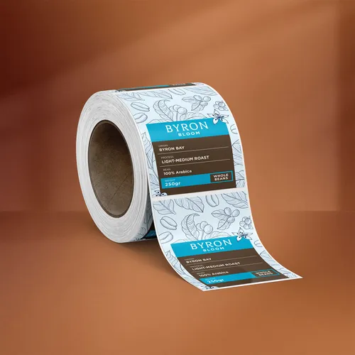
- Standardise colours and type across SKUs so your range looks unified and easier to spot.
Working With A Strategic Print Partner: A capable print partner does more than just take files and run them. They help refine material choices, finishes and technical details so the design works in real life, not just on screen. That guidance protects you from quality issues that quietly drain profit through returns, complaints and weak repeat sales.
Conclusion
Confident Labels That Win The Aisle: The psychology behind great food labels only works when design thinking and expert printing pull in the same direction. If you want your range to feel sharper, clearer and more trustworthy at first glance, now is the time to review your current labels, identify weak spots and partner with specialists who can turn your next print run into a genuine on-shelf advantage.